
HISTORY IN YOUR POCKET
MOBILE WEB APP
PUBLIC DIGITAL WALKING TOUR
CASE STUDY
CLIENT
CS Plaza Activities
(tour.christianscience.com)
ROLES
product designer | ux designer | ux researcher
design lead on a 5-person cross-functional team
DESCRIPTION
iOS mobile app
PROJECT SUMMARY
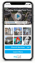
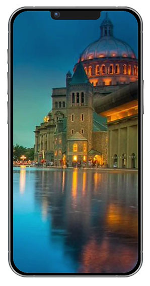
a digital walking tour of historic buildings, containing engaging visuals,
video, and an audio guide — including historical details and relevant facts
of what the visitor is seeing in real time


DEFINING THE PROBLEM
How can we embrace visitors to the plaza and help them appreciate the architecture and history of this place?
The 14 acre site of the Christian Science Plaza receives tens of thousands of visitors annually from all over the world. Some visitors go inside the buildings, some take guided tours, and some just walk across the plaza and enjoy the beauty.
This project began with feedback from plaza visitors, current tour guides, and security hosts. From the beginning of this project, we realized that the focus must be to embrace the community, and center our efforts on visitors to the plaza. Throughout each day plaza hosts would get many questions about the buildings and structure. Tours are available, but many visitors did not have the time or interest in a tour. There was a need for structured information when tours were not available or visitors had questions about buildings and history. A user-centered design approach was essential to develop a viable solution. Our small cross-functional team could now begin to put together this puzzle. We learned a lot from informal interviews. We had assumptions about what the digital tool would look like, and set our goals for the project. This information helped me develop a journey map to better understand who our user is, and define their goals.
ask why?
INSTILLING EMPATHY AND TRUST
First, we needed to understand who our target users might be. We gathered data from our interviews with plaza hosts, first-time visitors, everyday users, site employees, neighbors, and project stakeholders. In order to instill empathy, we developed personas within the general public—the casual but curious passer-by, one who doesn’t have time, or interest in a full tour, but is interested in knowing more about the buildings and their history. Designing for plaza visitors proved to be a challenge, but maintaining the focus on the user proved beneficial to meet the goals set at the beginning of the project.
curiousity
target persona

KEY FINDINGS
Ease of use would be a key factor for success. Our research was centered on current visitor feedback, employee observations, as well as controlled surveys. Visitor feedback indicated that there was a need for more flexibility for tours and public facing historical information. We found that one of the up front challenges was to build trust with visitors, regardless of their religious affiliation. Establish the historical education purpose upfront was the goal. Making it clear that these tours were for everyone. The tours were intended to include historical facts, not religious theory.
collaboration


architecture
DESIGN APPROACH
Getting the basics ironed out, I began with low fidelity sketches to determine the architecture and content. It was clear that this project required a user-centered design approach to develop a solution to the key problem. Visitors needed a way to access building information and historical facts. The primary focus was to design a digital tour, where the visitor could remain anonymous and access the information at their leisure.
COLABORATION
During our two-week sprints, our dedicated cross-functional team discussed possible solutions and I developed several iterations of prototypes. We discussed an internally tested several different concepts, including a location-based alternative. Early on, it became clear to simplify the tour and focus on three separate stops. The content for the stops was determined by feedback and card sorting data.
SOLUTIONS
With all of the content determined and approved by our legal department, I was able to quickly develop high fidelity working prototypes. Some concept ideas were shelved to keep for possible future iterations. It was important for us to keep the project scaled in order to determine our MVP and have a solid product for our targeted public launch date. However, I needed to make sure the design could be easily expanded as features and new information was added.

scaled wireframe
BUILD, TEST, AND LEARN
The wireframes I initially created were simplified to focus on our MVP. We decided on three different stops rather than with five. This simplification made it possible to implement a finished product to the public sooner, with the possibility of future expansion of tours and information after launch. Additionally, the design system and functions of the app required scaling.
Important accessibility features were kept on the priority list to be incorporated in a second release. Closed captioning and subtitle translations or audio narration language choice were planned for the next iteration to allow an expedited release of the tour.
Our team conducted the guerrilla usability field testing on-location on the plaza (just as the product was intended to be used). Testers were randomly selected with the target persona in mind. Feedback was evaluated and empathetic solutions were incorporated into the subsequent iterations. The final working prototype was refined and approved by the Board of Directors and various stakeholders with all modification details documented.
testing
evolutionary prototype


iteration
PROTOTYPE
User testing proved our theory that nobody would want to download an app for one-time use. Therefore, the concept was built as an app on a web platform. This format enabled us to easily alter the content and evolve over time. The content and media was developed in-house with an engaging script along with corresponding images and video.
The convenience and comfort of viewing a phone screen vertically, rather than horizontal, proved familiar to users. Therefore, all images were selected, modified, and optimized for use in a vertical format for a phone (our primary format). This proved challenging due to cropping limitations, but paved the way for a more usable product. The design system was created to align with established brand guidelines already in use by the organization.
feedback
DEVELOPMENT
Development of the mobile platform website proceeded by working closely with an outside vendor, and launching live to the public within a few months of our first 2 week sprint. Some flexibility needed to be granted due to limitations the developers were faced with, but the quality of the final product was still well received.
POSITIVE REVIEWS
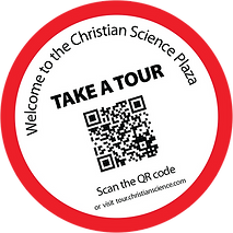
Once the MVP of our app was live to the public, marketing was put in place, offering visitors a chance to check it out and give feedback. Plaza signage included visuals to direct the public to take a tour through a QR code link to instantly load the interactive web page on their phone, without downloading anything.
This project launched shortly before the covid pandemic set in. Nobody thought of the benefits of continuing the virtual tour services throughout the pandemic without face-to-face contact. The organization was able to maintain community engagement while maintaining public safety and established restrictions. Positive reviews, gratitude, and feedback were received from plaza hosts, site services, and the general public.
Since the format architecture was in place we developed a the content could be modified and how we could add more information. This paved the way to frame phase two of the project.
Figma, Adobe XD, After Effects, Flinto, Illustrator, Photoshop, Premiere